Posts Tagged ‘ Strip Club ’

Best (and Worst) 16/17

Ahead of each season I skim football kit websites looking at the upcoming season’s offerings. Here are some of the best and worst I came across. (Note: no EPL kits below as I will be doing an 2016/17 EPL kit preview when the new season starts.)

maribor-16-17-away-kit-2

(pic courtesy of Footy Headlines)

NK Maribor first came to my attention in the late 90s/early 2000s during their dominant period in Slovenian football. When I saw their away shirt I instantly loved it. One of adidas’ new templates is a horizontal bar that alternating different shades of the same color, in this case purple, which switches in the middle of the chest. The yellow trim around the crew collar is a nice touch. Definitely a hipster’s choice.

bologna-2016-2017-macron-home-kit-5

(pic courtesy of Football Fashion)

As I scanned through the jerseys for the upcoming season, this kit from Bologna really jumped out at me. Similar in the way the Crystal Palace home shirt from last caught my eye, the home strip for I Rossoblu gets the job done. The half and half colored collar and sleeves and big bold stripes give the strip a great look.

palermo-16-17-away-kit

(pic courtesy of Footy Headlines)

Another Italian team got a really nice shirt for the upcoming season. Palermo is usually associated with their pink home shirt but their white away kit kit for the upcoming season is gorgeous. Taking the band that typcially goes across the chest, Joma broke it up and it serves to highlight the club badge. A pink collar accents the shirt as well as the black piping. Beautiful shirt and wonderful set from Joma for the 16/17 campaign.

porto-16-17-home-kit-2

(pic courtesy of Footy Headlines)

Porto almost always makes this annual post, usually for bad reasons. For this season New Balance has taken a recent design element one step further. Pinstripes inside of solid vertical bars seems to be a trend, I’m thinking Montreal Impact, Juventus, Borussia Dortmund, and the American company has amplified it with a gradient visual.  Up close it’s an interesting take but will probably barely even see it on TV.

benfica home

Staying in Portugal, while I like shirts painted on women as much as the next guy, this release from Benfica is top notch.

bordeaux-16-17-kit (3)

(pic courtesy of Footy Headlines)

OMFG. What can you say about this? Bordeaux’s third strip uses images from the city and maybe it’s because I’ve never been there but this doesn’t work for me at all. Cluttered, jarring, just not good. Perhaps had they taken one image and shadow printed it, that might have worked. Puma overstepped the bounds on this one.

odense-bk-2016-2017-hummel-kit-6

(pic courtesy of Football Fashion)

No idea how I found this one but Hummel produced a jersey Danish club Odense that uses their iconic chevron branding and combines it with vertical stripes. Inside the bars you will not find pinstripes but a checkered geometric pattern. I like this shirt, the stripes, the color and solid back for the number set.

besiktas-16-17-home-kit

(pic courtesy of Football Fashion)

Usually when I look at Turkish teams, I am drawn to Galatasaray, who have had some really sharp designs over the last couple of seasons. Scrolling though the 16/17 kits I saw Besiktas’ home offering and wondered if this team going to compete for the Turkish Super Lig or the American League crown. Holy pinstripes. Don’t like this one at all.

nec-nijmegen-2016-2017-patrick-kit-4

(pic courtesy of Football Fashion)

NEC Nijmegen won promotion to the Eredivisie and decided to put two designs up to fan votes. Based on the post from Football Fashion, the voting was so close that the club will two home jerseys. I like the simplicity and use of club colors for both. Whether two shirts is good or bad, I’m not sure and hope this doesn’t give major manufacturers and clubs a horrible idea moving forward.

If you know anything about the early years of the Premier League, then you’ll know about this shirt:

norwich home 92 94

(pic courtesy of Norwich City)

Now there’s this:

norwich-city-16-17-third-kit-3

(pic courtesy of Footy Headlines)

Errea decided to bring it back but in white. I think the only positive is that the Canaries are in the Championship, so I won’t have to see this unless I really really want to.

hajduk-split-16-17-kit (2)hajduk-split-16-17-kit (5)(pics courtesy of Footy Headlines)

Let’s end on a high note. Footy Headlines brought the new Hajduk Split home kit to my attention and I am so thankful. What a kit. Clean white shirt with hints of gold paired with royal blue shorts and royal blue socks with white turnovers. Real beauty.


——

Check out my previous season previews and other kit reviews on the Strip Club page of the SoccerNomad blog.

——

So those are the ones that caught my eye. If you want to see more, I encourage you to visit the following sites. . .

Football Fashion

Football Kit News

Football Shirt Culture

Footy Headlines

Quality posts, great pictures and a wide selection on offer.

Plus there are several great podcasts on kits and kit design. Check out the Football Attic kit podcast and the podcast from Design Football.

Strip Club–Tip Out Edition

As I’ve written before, Euro 2000 was one of my favorite and most memorable soccer tournaments ever.  During a window in the late 90’s to early 2000’s, I turned from casual fan into full-on Soccer Nerd.  During those years I was reading, watching, coaching and playing to a level that raised the game to an obsession (an unhealthy one my wife might add) in my life.

One of the disappointments of that tournament was Germany.  The defending European champions had crashed out against Croatia at the 1998 World Cup and began defense of their title with a strong Bayern Munich contingent, a sprinkling of German contributions in the English Premier League and some domestically based stars.

The Germans were drawn in a group with Romania, England and Portugal.  In the opener, Mehmet Scholl pegged back the Romanians with a goal to secure a point (his goal is early in the video).  Next up was England, and Alan Shearer doomed Die Mannschaft to an early exit with a headed goal, marking the first time that England had won a competitive match against Germany since the 1966 World Cup final.

Portugal added insult to injury with a 3-0 demolition via a hat trick from Sérgio Conceição.  The winger nodded in Pauleta’s shot cum cross at the back post before getting laid out by Kahn to open the scoring.  Conceição then danced around Hamann and hit a shot right at the German keeper, which somehow he didn’t save.  Later in the second half, Conceição was released down the right hand channel and thumped his shot home to the far post.

The poor performance of the Germans started a rebuilding process that is paying dividends to this day.  Two years later Germany were in the World Cup Final.  They made the World Cup Semi-Finals in 2006 on home soil and were Runners-Up at Euro 2008.  Another Semi-Final appearance at World Cup 2010 was followed up by Semi-Final defeat by Italy at Euro 2012.  The team is poised for great things at the 2014 World Cup with players hitting their prime and Bayern Munich finding domestic and European success.

As for the jersey itself, I got it in unique circumstances.  The BIGGBY franchisee I worked for had three daughters.  The oldest daughter’s husband was in town on break from military service and was looking for a soccer game.  I hooked him up at a local facility and afterwards he said he had a jersey that he didn’t really wear or want.  So I took the bait.  Turns out it was the Germany away shirt from Euro 2000, which was seen in the game against England.

In my research, I found this information from Picking up the Threads about the color green being used:

The German away kit is traditionally green and white; there is a widespread urban myth that this was a mark of respect that Ireland retained neutrality in WWII, or they played their first post-war friendly against them; however neither of these stories are true (it was in fact Switzerland who West Germany first played a post-war friendly against in 1950).  The colours of the away kit actually reflect the colours found on the flag of the second biggest kingdom of ancient Germany; Hannover and Saxony.

The shirt is a little big and can get a touch heavy during hot conditions, but I love the look.  Adidas incorporated the German flag into the collar, bands on the sleeves and the three stars representing each World Cup victory.  One of the coed teams I played on recently used green as their team color, so I made sure to wear it every once in a while.  I enjoy watching this current German team, so break out the jersey occasionally during International weekends.  For the 2013 Champions League Final, I wore it to the Watch Party as I didn’t support either Bayern Munich or Borussia Dortmund.  It’s a nice collector’s item but not a heavy part of the rotation.

Strip Club–First Time Edition

The MLS launched in 1996 and as a relatively new soccer fan I felt compelled to pick a team.  DC United was my choice and not for the color scheme, although red, black and white resembled a certain other United I was fond of.  Rather I chose United because of the ten teams in the inaugural year of the league, they were the only ones that had a proper name.  Remember this is the league of the Clash and the Metrostars and the Mutiny and the piece de resistance—the Kansas City Wiz.

But truth be told, after the opening game of the season, I didn’t really watch much of the league, only catching snippets from time to time.  I didn’t even watch probably one of the greatest MLS games ever—the 1996 MLS Cup Final, which saw DC United defeat LA Galaxy, coming down from 2-0 in the last 20 minutes on a rain soaked pitch in New England to win in extra time 3-2.

Another superficial strength of DC United was their kits.  Home (black) and away (white) were both safe colors with three stripes across the chest reflecting the manufacturer adidas.  Red shorts and white socks completed the strip and these, while unspectacular, were miles ahead of the Nike inspired disasters throughout the rest of the league.

dc united

1996-team-photo-first-match

For a time I had the black home shirt, which had two problems.  One, the material was heavy.  I have to believe that the authentics were lighter.  The shirt felt almost like a football jersey and I can’t imagine playing in that kit the summer heat or in the rain that fell that day in October 1996. Wicking away moisture was not a strength of this version.  Two, the jersey was huge.  I think my brother and I picked them out at an outlet mall or something, so maybe I had to take what I could get.  It was the mid 90’s so big was in but this shirt was huge on me.

Eventually this shirt was lost to the dustbin of history during one my kit purges.  I didn’t follow the MLS and the shirt was too big.  Into the giveaway pile it went and hopefully some appropriately sized soccer lover found it at Goodwill and enjoys it to this day.

Strip Club–Manchester United 2013/14 Dollar Date

The Manchester United kits have been released for the upcoming season, and regardless of design, the Red Devils will be sporting the gold Premier League patch, signifying another championship, which is really all that matters.  Hopefully Moyes can keep things rolling domestically while making a push in Europe.

Manchester United 13-14 Home Kit (5)

The home kit returns to a solid red with no trim whatsoever.  A white Nike swoosh, black devil just under the collar at the back of the neck, and the badge are all that accent the shirt.  Well that and the buttons and the collar. Simply put, too many buttons.  I count six (with one on the back of the neck) and looks kinda grade school. Plus if you button it all the way up, not a good look.

The return of the collar has been listed as a selling point, harkening back to Cantona’s time at the club in mid-90’s.  The problem is that the design revealed when you flip the collar is awful. United’s offical site tries to put a historical spin on the collar design:  “Underneath the collar is a subtle tonal grey-and black-gingham check, first used on last season’s home shirt. The check represents Manchester’s industrial past, referencing the city’s cotton mills of the 18th century, which once produced the classic check fabric”, but I call bullshit or shenanigans or something.  The kit is completeled by white shorts with the club badge and manufacturer, and black socks with accented stripes around the shins.  In the end, the home shirt is ok but it continues a worrying trend of meh and deterioration from the epic 2007-09 shirt.

manu buttons

As for the away strip, leaks have been out for months.  While the shade of the shirt varied, the design did not—in essence a bluer version of last year’s red home shirt.  The final product is indeed a blue variation of “the iconic gingham check”.  To be honest the red shirt grew on me last year with the pattern fading on TV.  This shirt already looks sharp and the entire kit is fantastic.  I really like the midnight navy blue throughout and the all white crest, and while I won’t buy it, I won’t slag it off like the away kit from two year’s ago.
New-Man-U-Away-Shirt-2013-2014

So Phil Knight’s men did an acceptable job this year.  No #StoptheSleeve madness, which I appreciate, but room for improvement next season.

Strip Club–La Liga Kits 2013/14

I have made another attempt to gather all of the La Liga kits into one place.  This season I have modeled my page on Kit Nerd’s posts on EPL and MLS kits.  I have gathered as many images as I could and commented on almost every kit for the upcoming season. There are plenty of great sites that have breakdowns, information and pictures of this season’s kits. Please visit the links for even more info.

——

Almería (Courtesy of UD Almeria website)

Home / Away / Third

Almeria-Football-Shirt-13-14

Surprisingly Nike makes the kits of newly promoted Almeria.  Although the club uses templates and previous designs, the range is decent.  The home kit is a very simple shirt of red and white veritcal stripes with a ring collar, red shorts and white socks.  The away kit is almost identical to the Malaga away kit from 2011/12.  The third kit is Nike’s recent V template that began with Manchester United.  A light royal blue is the base of the shirt and socks and is finished off with white shorts.  According to the website this was used last year as well.  Hopefully the rojiblancos stay away from the fuchsia kit as much as possible.

Athletic Bilbao (Courtesy of Football Kit News and Football Fashion)

Home / Away

Bilbao Home Kit 2013 14

Athletic switch to Nike from Umbro this season, and Phil Knight’s men have given Los Leones a nice foundation.  The home strip is relatively standard, with the traditional red and white stripes and black shorts.   The away strip is all royal blue, which I like, but the shirt unfortunately suffers from the Nike sleeve syndrome.

Atlético Madrid (Courtesy of Footy Headlines and Football Fashion)

Home / Away

Atleti head into this campaign with a typical home kit—red and white striped top and blue shorts— with the post from Footy Headlines noting, “The red and the blue are darker than usual to celebrate the Spanish League and Spanish Cup title won in 1965/66.”  As for the away strip, it’s quite different and I’m not familiar with this color palette for Los Colchoneros at all.  Like the pairing of the navy blue and yellow top with the navy blue shorts but not sure how the yellow socks are going to look.

Barcelona (Courtesy of Footy Shirt Culture, Total Barca and Football Fashion)

Home / Away

Barca-kits-2013-14
Quick summary: The Blaugrana and the Swoosh are back on the right track.  The home kit returns to its roots, while the away is a one off historical gesture.  Would have preferred they used the senyera as a third kit, but there’s always next year. Full comments can be found here.

Betis (Courtesy of Football Kit News, Inside Spanish Football and Real Betis Website)

Home / Away / Third

Betiskits

Macron has produced an interesting range of kits for the verdiblancos.  The home shirt is the traditional green and white vertical stripes and removes the solid green block that ran from the chest to shoulders last year.  The away strip swaps white for black and slightly darkens the green, which according to ISF, “is to honour the 100 year anniversary of the club (1914) as we know it today.” The third kit is all sky blue accented by the green and white colors of the club and looks nice.

Celta de Vigo (Courtesy of Footy Headlines and Football Fashion)

Home / AwayThird

adidas - presentacion 01

The Galicians have used a sky blue and black palette to good effect for the upcoming season.  The home shirt is sky blue with black trim along the shoulder and around the neck.  The away top is black with a sky blue design around the neck and shoulders.  Both kits sport a Triskele, which thanks to Wikipedia, I learned is “a motif consisting of three interlocked spirals, or three bent human legs.”  The club also has a third kit that was released early in 2013 which uses the Campeon 13 template by adidas (see Spain’s Confederations Cup shirt).

Elche (Courtesy of Football Kit News and Diario Franjiverde)

Home / Away / Third

elche-cf-2013-2014-kits-9

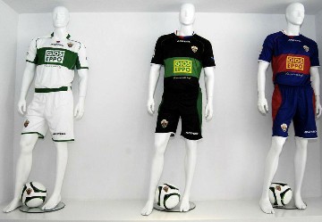
This team from Valencian Community returns to the top flight for the first time 1988/89.  The kit line is produced by Italian company Acerbis and the range isn’t too bad.  The home kit is very simple white kit trimmed in green.  The away kit uses royal blue and red, which appears to be homage to the team’s badge.  The third kit replaces the white of the home with black and kinda reminds of a Green Lantern uniform.  All of the kits will have a logo at the back of the neck commemorating the club’s 90th anniversary.  Finally, not sure “Have a Nice Day” across the front of your shirt is the way to go.

Espanyol (Courtesy of Football Fashion)

Home / AwayThird

Espanyol 13-14 Kits (2)

The home kit of los pericos is solid, using thicker royal blue and white vertical stripes than usual.  No complaints with this strip.  The other two however are sketchy at best.  The away shirt looks like a t-shirt but creates a nice strip with black shorts and socks.  The third kit almost seems to be trading on the Seattle Sounders designs.  Pics on numerous sites show the entire kit with turquoise shorts, while the socks are turquoise/lime green hooped.  Be interested to see how it translates to HD TV.

Getafe (Courtesy of Football Fashion, Football Kit News and Getafe CF)

Home / Away / Third

New Getafe Kit 13 14

Spanish manufacturer Joma provides the kits for Getafe, who are celebrating ten years in the top flight.  Gone is the Burger King sponsorship in the middle of the shirt, which is sadly missed.  The home and away kits are understated, with a light royal being used for the home uniform and a deep red for the away kit and each shirt is trimmed in gold.  The third strip is a lime green which does not work for me.

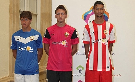
Granada (Courtesy of Football Kit News)

Home / Away / Third

Equipacion Granada CF 2014

The Granada kits are made by Spanish sportwear company Luanvi, which I know nothing about.  The range of kits is relatively simple and straightforward, with the home kit using horizontal red and white stripes and blue shorts.  A Spanish club equivalent of the Where’s Waldo USMNT jerseys.  I really like the away kit, which is all white with red and green accents.  The third strip is just ok for me, using a metallic blue with black.  Maybe up close it will appeal to me more.  The goalkeepers have a choice of four different kits, which seems excessive to me.

Got some exclusive content from Heath Chesters who is the Community Manager for club and runs their English twitter account:

The club chose to go for more classic designs this season, hence the simplicity of the styles. More akin to the simple horizontal hoops of the 70’s & 80’s, which is more popular with the fans, than the “barcode” design of last season.

Along with a return to classic design, the club also wanted to recognise the city itself. The white away kit features a green & red trim, which are the colours of the city flag of Granada, whilst the Alhambra stencil on the upper chest is a nice touch, with Granada’s most famous landmark.

The third kit is something a little different for Granada in terms of the choice of colours, but a nice alternative I think.

Finally, I often see a lot of comments regarding Granada having a choice of four goalkeeper kits. Principally it’s to offer the goalkeepers themselves the choice of colours they like. 1st team keeper Roberto traditionally plays in pink, whilst the other three match the preferences of the backup & B team keepers, plus the women’s team keeper.

The women’s team gained promotion to the Primera last season. Their kits are the same design overall, but the shirts are made to fit the female form better, which is another nice feature from Luanvi.

Levante (Courtesy of Football Shirts)

Home / Away / Third

levante

Kelme has released kits for Levante’s upcoming campaign, buidling on last year’s set of kits, and has promoted them using some sort of superhero motif.  Weird but ok. The home kit is screaming Barcelona, even down to the huge bands at the edge of the sleeves, and if it wasn’t for the collar accent, you would be hard pressed to tell the difference.  It does look sharp though. The away kit is black with alternating black and grey vertical stripes.  Really like this shirt and it is enhanced by the club crest all in white. The third kit uses a couple of greens going horizontally, with the club colors of red and blue trimming the sleeves.  Again a crest in white accents the kit. I like all three selections and hopefully Los Granotes can bounce back after a disappointing finish last season.

Málaga (Courtesy of Football Kit News and Football Fashion)

Home / Away / Third

malaga

Málaga had a mixed 2012/13 on and off of the field.  Quarter Finalists in the Champions League and a sixth place finish in La Liga, but with players leaving and suspended from Europe for the upcoming season, things are uncertain at best.  However, their kit selection is solid, so they’ve got that going for them.  Navy blue is introduced to the home shirt and is an attractive change and accents the sponsor nicely.  I love the away shirt.  Much like Sevilla’s third kit last year, the navy blue is super sharp and there are almost no distractions.  Nike is providing Los Boquerones with an orange third kit, which is a pleasant choice, better than the lime green of a couple of seasons ago, but the sleeves are a let down in typical Nike style. The post at Football Fashion has the layout of the full kit plus this little tidbit of info:

According to English language website: Málaga Club de Fútbol has chosen an exclusive design by NIKE, coaching sponsor of the Club, with the colours, light blue, navy and white, which will fill every part of La Rosaleda stadium. A new addition this season, is the slogan ‘Coraje y Corazón’ or ‘Courage and Heart’ printed on the back of the shirts, along with the flags of Spain and Andalucía.

Osasuna (Courtesy of Football Shirts, Football Kit News and Footy Headlines)

Home / Away

Osasuna switches to adidas for the upcoming season and the offering from the brand with the three stripes feels very MLS-ish.  The shirt uses the traditional red but the blue trim and collar create a jersey that is right off of the American rack.  It’s fine but the cow part of the sponsor is a little unsettling.  The away strip is some sort of neon green.  The pic in the hallway pregame doesn’t look that great but I found a team pic pregame and the strip looks great in the sunlight, with a bold shirt and black shorts and socks.

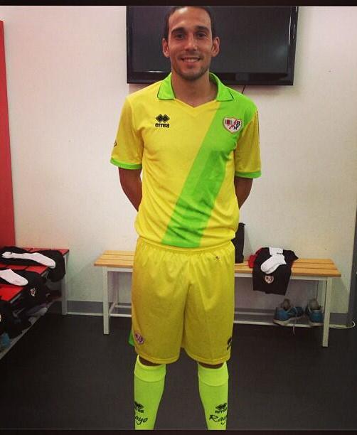
Rayo Vallecano (Courtesy of Football Fashion and Football Kit News)

Home / Away / Third

Rayo Away Kit 2013-14

The Rayo Vallecano home shirt is iconic and standard–white base with red sash runninng from right to left.  This year’s is no different, although I feel the diagonal is slightly wider.  The away kit reverses out the white for black and looks sharp as well.  The third strip is awful.  Taking a page from the Norwich City palette, using predominately yellow with neon yellow highlights, and the socks must surely glow in the dark.

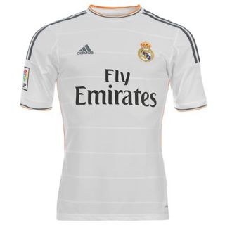
Real Madrid (Courtesy of Football Fashion and Real Madrid Shop)

Home / Away / ThirdGK

real madrid h
Adidas introduced orange onto the white shirt of Real Madrid.  Interesting for sure and looks good, especially combined with the charcoal trim.  There are also horizontal pinstripes, which, Football Fashion notes, “presents a pattern of horizontal block building, giving the shirt a different texture and very attractive depending on how the light given.”  Not sure that was necessary but we’ll see. Retro is the theme of the away kit, using an all royal blue strip.  The orange trim is used on this shirt as well.  Found it interesting that Morata was used in the advertising pictures.  Liked his brief appearances last year and hope he gets more of a run this year. The third kit is an “energetic” orange. Could be nice if it comes across on the TV.  Maybe a contrasting short would make strip not so sherbert-ish.  The home goalkeeping kit uses the historical purple to create a dynamic look for Saint Iker (or whoever Carlo decides to play in goal).

Real Sociedad (Courtesy of Football Kit News)

Home / Away

New Real Sociedad Kit 13 14

Real Sociedad surprised many people with a surprise fourth place finish last year.  Their kit launch featured kits with the Champions League logo, even though they will still need to qualify.  Could get awkward if they fall at that important hurdle. For the jerseys themselves, the home kit is tried and true, sky blue and white vertical stripes.  Nike didn’t do anything extravagant here.  The away kit is almost all black.  The top just has the crest and Nike swoosh and what appears to be the Basque flag at the back of the neck.  The shorts have white trim just above the hem on backside.  The socks are topped in white with an angled white design.  Both kits are uncomplicated, which is a minor shock from Nike.  The goalkeeper kit though.  Yeesh.  Some sort of electric pink from head to toe.  Poor guy.

Sevilla (Courtesy of Footy Headlines and Football Fashion)

Home / Away

sevilla-fc-warrior-2013-14-kits-

Warrior enters the La Liga fray this season as Sevilla switches from Umbro to a brand doing almost everything it can to ruin soccer kits (see Liverpool away and third strips for 2013/14). The home shirt is tame, using a white base with red trim and an intriguing collar.  The only really standout item is the diagonal pattern across the chest.  Combine this with a crest referencing the original badge of the team and the strip is actually quite decent. The away kit takes a page from the Liverpool away shirt from 12/13, using some sort of accent that drapes down the neck and shoulders.  The strip is tolerable and definitely not the eye sore associated with the brand.

Valencia (Courtesy of Football Shirt Culture and Football Fashion)

Home / Away / GK

valencia
Football Shirt Culture put together great posts which have pictures showing the dynamic details for Valencia’s home and away kits. The home is the standard white with black and orange accents.  I really like the thin orange collar and narrow bands on the sleeves, but what really sets this shirt apart is the crest.  Similar to what Manchester United did on their away kit last year, the logo removes the senyera colors and all items are laid out in black and white.  The Comunitat Valenciana senyera does make an appearance on the back of the neck.  Combined with black shorts and white socks, this strip is a real winner. As for the away offering, using an orange base, the kit uses black and white accents to great effect.  The collar is half each color, very subtle (similar to Holland’s home kit for World Cup 2010), and a half and half diagonal band across the chest.  Again the regional senyera is at the back of the neck. Would be difficult to go wrong with either of these.

Valladolid (Courtesy of Football Headlines)

Home / Away / GK

Hummel took over the design and production of Valladolid kits for the upcoming season. The home uses very thick purple and white stripes, similar to last year’s offering from Kappa, using a white collar instead of purple.  This is a sharp kit and I really like it due to the different color scheme than most teams. The away kit touches a nerve for me, expanding on the Purple Reign Pain offerings from Nike last year for Porto and Arsenal.  I can’t tell if I like the white trim and accents.  This one may grow on me though. I really wish the goalkeeping shirt was the third shirt because it uses a nice royal blue with white and black accents that really take a plain jersey and make it stand out.  Would have gone with white or matching blue socks rather than the black though.

Villarreal (Courtesy of Football Kit News)

Home / Away

Villarreal Kit 2013 14

The Yellow Submarine return to the top flight and also celebrating their 90th anniversary.  The kits are made by Chinese company Xtep, another company I am not familiar with, and no chances are taken.  The home strip is the standard all yellow with a big collar and some sort of sublmation across the chest.  The away kit uses royal blue from head to toe and looks sharp.  The goalkeeping kits are fine, with green and gray being used.  Hopefully Villarreal can consolidate their place, move up the table and possibly move on to a bigger manufacturer.

Strip Club–ATF Edition

The FC Barcelona centenary jersey is one of my favorite jerseys of all time, and the moment it arrived in my mailbox, I felt that my life was complete.

00E9DA3000000578-3041525-Romario_fires_home_Barcelona_s_second_goal_in_their_1994_rout_of-a-11_1429182016893

My first exposure to the Blaugrana was their demolition of Manchester United during the 94-95 Champions League Group Stage. I was stunned when my best friend told me the score and figured this team had to be pretty good. Little did I know that I had just missed the Dream Team and their first European Cup triumph (1992).

FINAL_RECOPA_1997._GOL_DE_RONALDO_DE_PENAL.v1412007128

Due to limited TV coverage, the first time I actually saw them play was the 96-97 UEFA Cup Winners Cup Final, a drab game decided by a penalty kick from the original Ronaldo and after his one season with the club, he would go on to Inter. For the next couple of years, ESPN would show a Spanish game on Monday afternoons, which were must viewing for me, and I would reschedule soccer practice so that we could watch the games, with games involving FCB involving mandatory participation.

hi-res-1203694_crop_north

The 1999-2000 squad had great players, like Rivaldo, Figo, Luis Enrique, and a large Dutch contingent—the de Boer’s, Reiziger, Zenden, Cocu and Kluivert—and a certain Pep Guardiola. That season they finished empty handed, losing the Spanish Super Cup, finishing second in the league, getting crushed 6-0 on aggregate by Atletico Madrid in the semis of the Copa del Rey, and being knocked out of the Champions League by Valencia in the semis. After this season Van Gaal and Nunez left the club and, lest we forget, Figo signed with the enemy.

The kit is not a typical FCB jersey with the multiple blue and red/burgundy stripes, instead it is just half and half (with a very interesting shade of metallic blue) with navy sleeves, a bold reminder of Joan Gamper’s Swiss influence so many years ago. The half and half design was a call back to the original shirt and a precursor of the jersey worn during the magical treble season of 08-09. As for the jersey itself, it is lightweight, classy and timeless. I almost never wear this one to play in because I don’t want anything to happen to it.

Barcelona 1999-00 Home Centenary Detailed

As the image shows, burgandy accents the navy blue cuffs and a dynamic centenary patch brings attention to the historical year for the club. The club crest and historical markers are simple and understated, and the gold name/number set were a nice touch. (I wish now that I had mine personalized). It took me a while to realize that the kit did not have a sponsor. Of course money eventually won the day, with the club needing an additional revenue streams to maintain their status on and off the field. In the end, the strip is not from a memorable season but the jersey itself is one for the ages.

Strip Club—Feature Dancer Edition

France 98 was the first World Cup that I watched extensively, even more than USA 94, which was in my home country. that summer I was living with my parents, had no job, and basically woke up and watched double and triple headers during the Group Stage. It was heaven.  I particularly followed France because a) they were the hosts and got tons of coverage; b) the US was having a nightmare (thanks Steve Sampson); and c) Juventus had several stars on the team, which gave me a natural connection.

zinedinezidane

Deschamps and Zidane were part of a fantastic cycle of Bianconeri teams which went to the Champions League Final three years in a row and reached the semis the year after before being rebuilt in 2001. Zidane was in imperious form at the time, dazzling for both club and country. Deschamps controlled the midfield, generating service for Guivarch, Henry and Trezeguet, and protecting a back line that was already quite strong. The Final was spectacular for the hosts, with Zidane famously knocking in two headers and Petit adding a third.

trezeguet

Two years on, the World Cup winners travelled to Euro 2000 in Holland and Belguim. I bought the entire tournament on PPV (those were the days) and watched nearly every game live. What a tournament. Spain’s comeback against Yugoslavia; England collapsing against Portugal; impressive performances from Slovenia; Holland’s demolition of Yugoslavia in the quarters; a fantastic game between France and Spain with goals of great quality and a tragic PK miss from Raul; and a gripping final, in which Italy had one hand on the trophy but couldn’t finish the job. A goal from Wiltord forced extra time, during which Trezeguet scored a Golden Goal to win.

france-2000

(image courtesy of Historical Kits)

On the fashion front, French jerseys have been hit and miss over the years. The mid-90’s kits were cool, if a bit shiny, and I hated the 1998 jersey, but immediately bought the Euro 2000 home kit, which has become one of my favorites. I love this jersey because it is simple and clean in design. The royal blue is a perfect shade and has an understated red stripe across the chest.  The above image shows the traditional tricolor layout, and I would prefer blue shorts and white socks to complete the strip but the red socks aren’t too bad. While the jersey is a little heavy (you sweat like a dog if it’s 70+ degrees but Under Armor takes care of that), the best part is that you pop the collar, channel your inner Zidane, and you are good to go.

The jerseys of the first decade of the 21st century have had some winners and losers, with the highlights being Euro 2004 (a hazy version of 2000) and World Cup 2006 (a pretty sweet adidas template). The kit for the 2010 World Cup wasn’t too bad but was worn by a disaster of a team. Here is a sampling of jerseys from 1980 to 2010.

While France have been disappointing since Zidane led them to the World Cup 2006 Final, I’m hoping this latest generation can recapture the spirit of the 1998/2000 team. Blanc has led the team to the European Championships, drawn in a group with Ukraine, Sweden and England, and now they must find the right mix of players and the right mentality to make the knockout stages. Allez les Bleus.

Strip Club–House Dancer Edition

At Euro 1996 I saw England destroy the Dutch 4-1 and dismissed them, but then I fell in love with Holland at the 1998 World Cup.  I enjoyed the way the Oranje played, with Davids and Cocu and Kluivert and Overmars and Bergkamp, who scored that fantastic goal against Argentina, and couldn’t wait for a final between Holland and France, but Brazil ruined that.  Two years on, I saw them sweep through the competition on home soil, including great games against France and the destruction of Yugoslavia before they fell to Italy on penalties.

AVEIRO, PORTUGAL - JUNE 19: Ruud Van Nistelrooy of Holland celebrates after scoring the second goal during the UEFA Euro 2004, Group D match between Holland and the Czech Rep at the Municiple de Aveiro Stadium on June 19, 2004 in Aveiro, Portugal. (Photo by Laurence Griffiths/Getty Images) *** Local Caption *** Ruud Van Nistelrooy

Somehow they did not qualify for the 2002 World Cup so my next chance to really watch them was in Portugal at Euro 2004, pitted against Germany, the Czech Republic and Latvia.  One of the best matches of the entire tournament was Holland against the Czech Republic (start at 4:01 of video), which featured the little and large combo up top of Baros and Koller, with Rosicky pulling the strings behind, plus Smicer and Poborsky and Nedved in the midfield. Holland came out on fire and were up 2-0 in the first 20 minutes after a headed goal from Bouma and a manipulation of the offside rule by Ruud van Nistelrooy.  The Czechs were able to pull one back as Holland tried to kill off the game in the second half, but Davids hit the post and RvN was denied by Petr Cech.  The moments after were truly magical as Koller chested down a cross for Baros to volley home and then minutes later, Smicer tapped in from close range after Van der Sar could only parry a shot and Poborsky unselfishly squared for his teammate.

51004385

In the other group games, Van Nistelrooy scored an amazing header against Germany to share the points, and then Holland crushed Latvia in the final group game to earn a place in the knockout round.  I don’t really remember much from the quarterfinal with Sweden that ended with Holland prevailing on penalties.  The Dutch again went down in the semis as an absolutely stunning goal from Maniche put the Portuguese 2-0 up and into the Final on home soil.

netherlands-2004

netherlands-2004-change

(images courtesy of Historical Kits)

These jerseys were another eBay special, getting both the home and away for a ridiculous price.  Again they are not 100% authentic, based on my research, but are pretty close.  Nike has done a good job with the Dutch kit over the years, and I love this template from Nike, which is one of their best efforts.  With the breastplate template and number centered and circled, the jerseys are class. Also the material is very light and breathes pretty well.  Unfortunately I ordered the wrong size so on a windy day I’m blown all over the field as the shirt acts as a wind sock but that’s my only complaint.

As I got ready to move to Atlanta, I went through my kit collection. While I loved these shirts and they had served me well through the years, I gave them to fellow soccer lover and groundhopper and podcast guest, Alex Baker. Hup Holland!!

Strip Club–Private Dance Edition

Juventus_team_2001_02

2002 was one of the peaks of my football consumption. My wife and I had been married just over a year as that season came to a close, and we had rented the upstairs of a house in downtown Lansing that was, how shall we say, quaint, but it had cable, including Fox Soccer Channel, and that’s all that mattered to me.  Cable was a luxury that would be sacrificed after the birth of our child and moving into a house of our own.

The run-in to that season saw Arsenal stun United at Old Trafford 1-0 to win the title; Valencia win La Liga for the first time since 1971; Real Madrid crush Leverkusen’s dreams hopes for European glory with a memorable strike from Zidane; but most of all it saw Juventus go for the double in Italy.

david_trezeguet

Heading into that campaign, the Old Lady strengthened their squad by signing Buffon, Thuram, Nedved, and Salas (totally forgot he played for Juve), adding to David Trezeguet the year before. Without a title since 1998, Juventus won their 26th Scudetto after Inter threw it away on the last day of the season. Led by Trezeguet’s 24 goals, the Bianconeri nearly won the double, falling to Parma on away goals in the Coppa Italia Final after winning 2-1 in Turin and losing 1-0 at the Tardini. In the Champions League they breezed through the opening group stage (remember the five minutes in Champions League history when there were two group stages before the quarters?) before being drawn into a tough with Bayer Leverkusen, Deportivo La Coruna and Arsenal. Look at the final table and how competitive it was.

Team

Pld

W

D

L

GF

GA

GD

Pts

 Bayer Leverkusen

6

3

1

2

11

11

0

10

 Deportivo La Coruña

6

3

1

2

7

6

+1

10

 Arsenal

6

2

1

3

8

8

0

7

 Juventus

6

2

1

3

7

8

−1

7

Bayer would go on to the final and Arsenal won the Premier League, while Depor would fall to Manchester United. Earning one point against Depor is what scuppered the Old Lady’s chances of progression.

juve away 2003

I couldn’t find a clean pic of the jersey (see above for a pic that I took), much less in long sleeves, so I refer to you to Colours of Football.

ita_juventus_2_0102

I really hated the kits of the Lotto years (the only other one Lotto got right was the silver jersey of 2000-01), but I remember seeing Juventus run out against Celtic in the all black strip, and I was instantly in lust.  Anyway, what a game, 4-3 to the Scottish team. I found this highlights package, including the goals and the panel remembering that night.  Tough loss but what a game and what an atomsphere.

The jersey was great, with the Lotto patches on the sleeves usually looking out of place, but, in this case, providing a nice accent. The jersey held up well after ten years and I loved wearing it on cool nights. My only complaint is that the cuffs were too big. This one became another victim of my kit purge and I passed it on to Peter Alegri, a lifetime Juventino. Forza Juve!!

Strip Club–Air Dance Edition

Real Madrid's Brazilian player Roberto Carlos (C) is congratulated by team mates after scoring a goal against Olympique de Marseille during their Champions League Group F match at the Santiagio Bernabeu stadium in Madrid September 16, 2003. REUTERS/Felix Ordonez PH

Over time my fandom of all sports and teams has been tempered by a realization that these are just games and should have no influence on how I feel about myself, how I treat others and how it impacts my day. For a while I followed FC Barcelona (watched games, tried to stay on top of transfer rumors, kept track of player news, followed club politics, etc.), but didn’t live and die with every result.

So FCB’s eternal rivals are Real Madrid and as a corollary, I should have hated Los Merengues, but I didn’t. What? I respect the club but don’t hate the club. I respect their heritage and talent but wasn’t going to spit on them. I really enjoyed Phil Ball’s book White Storm, which summarized the history of the club quite well.

becks

Had I started following Real Madrid during the first Galactico era (Figo, Zidane, Becks, El Fenómeno, etc), the Evil Empire may have been my preferred Spanish team. Instead I started watching the Blaugrana during the days of Rivaldo, Figo, Luis Enrique, and the Dutch contingent, and loved to watch their brand of football.

home

away

(Images courtesy of Colours of Football)

I say all this to explain why I had the 2003/04 Real Madrid Home and Away kits in addition to all of the FCB jerseys and items in my collection. I found them on eBay as a package deal for a ridiculous price so I picked them up.

galacticos

That season they were coached by Carlos Queiroz and finished fourth, losing their last five matches, with Valencia winning the title and FCB finishing second.  Los Merengues lost the Copa del Rey final to Zaragoza in extra time, while in the Champions League, after winning their group (2nd place was eventual champions Porto) and beating Munich in the round of 16, they lost to Monaco on away goals in the quarter finals.

The jerseys were fantastic—lightweight, breathed well, looked sharp. The Away kit wass a bit too big for whatever reason but the Home jersey fit snuggly and when I put the whole package together—white shirt, white shorts and white socks—I could understand the allure and dynamics of the all-white kit.

During my move to Atlanta I trimmed down my collection and gave the shirts to a couple of Los Blancos fans in Lansing. Now they can be worn by true fans in the club’s pursuit of the next title at home and abroad.