Best (and Worst) 16/17
Ahead of each season I skim football kit websites looking at the upcoming season’s offerings. Here are some of the best and worst I came across. (Note: no EPL kits below as I will be doing an 2016/17 EPL kit preview when the new season starts.)

(pic courtesy of Footy Headlines)
NK Maribor first came to my attention in the late 90s/early 2000s during their dominant period in Slovenian football. When I saw their away shirt I instantly loved it. One of adidas’ new templates is a horizontal bar that alternating different shades of the same color, in this case purple, which switches in the middle of the chest. The yellow trim around the crew collar is a nice touch. Definitely a hipster’s choice.

(pic courtesy of Football Fashion)
As I scanned through the jerseys for the upcoming season, this kit from Bologna really jumped out at me. Similar in the way the Crystal Palace home shirt from last caught my eye, the home strip for I Rossoblu gets the job done. The half and half colored collar and sleeves and big bold stripes give the strip a great look.

(pic courtesy of Footy Headlines)
Another Italian team got a really nice shirt for the upcoming season. Palermo is usually associated with their pink home shirt but their white away kit kit for the upcoming season is gorgeous. Taking the band that typcially goes across the chest, Joma broke it up and it serves to highlight the club badge. A pink collar accents the shirt as well as the black piping. Beautiful shirt and wonderful set from Joma for the 16/17 campaign.

(pic courtesy of Footy Headlines)
Porto almost always makes this annual post, usually for bad reasons. For this season New Balance has taken a recent design element one step further. Pinstripes inside of solid vertical bars seems to be a trend, I’m thinking Montreal Impact, Juventus, Borussia Dortmund, and the American company has amplified it with a gradient visual. Up close it’s an interesting take but will probably barely even see it on TV.

Staying in Portugal, while I like shirts painted on women as much as the next guy, this release from Benfica is top notch.

(pic courtesy of Footy Headlines)
OMFG. What can you say about this? Bordeaux’s third strip uses images from the city and maybe it’s because I’ve never been there but this doesn’t work for me at all. Cluttered, jarring, just not good. Perhaps had they taken one image and shadow printed it, that might have worked. Puma overstepped the bounds on this one.

(pic courtesy of Football Fashion)
No idea how I found this one but Hummel produced a jersey Danish club Odense that uses their iconic chevron branding and combines it with vertical stripes. Inside the bars you will not find pinstripes but a checkered geometric pattern. I like this shirt, the stripes, the color and solid back for the number set.
(pic courtesy of Football Fashion)
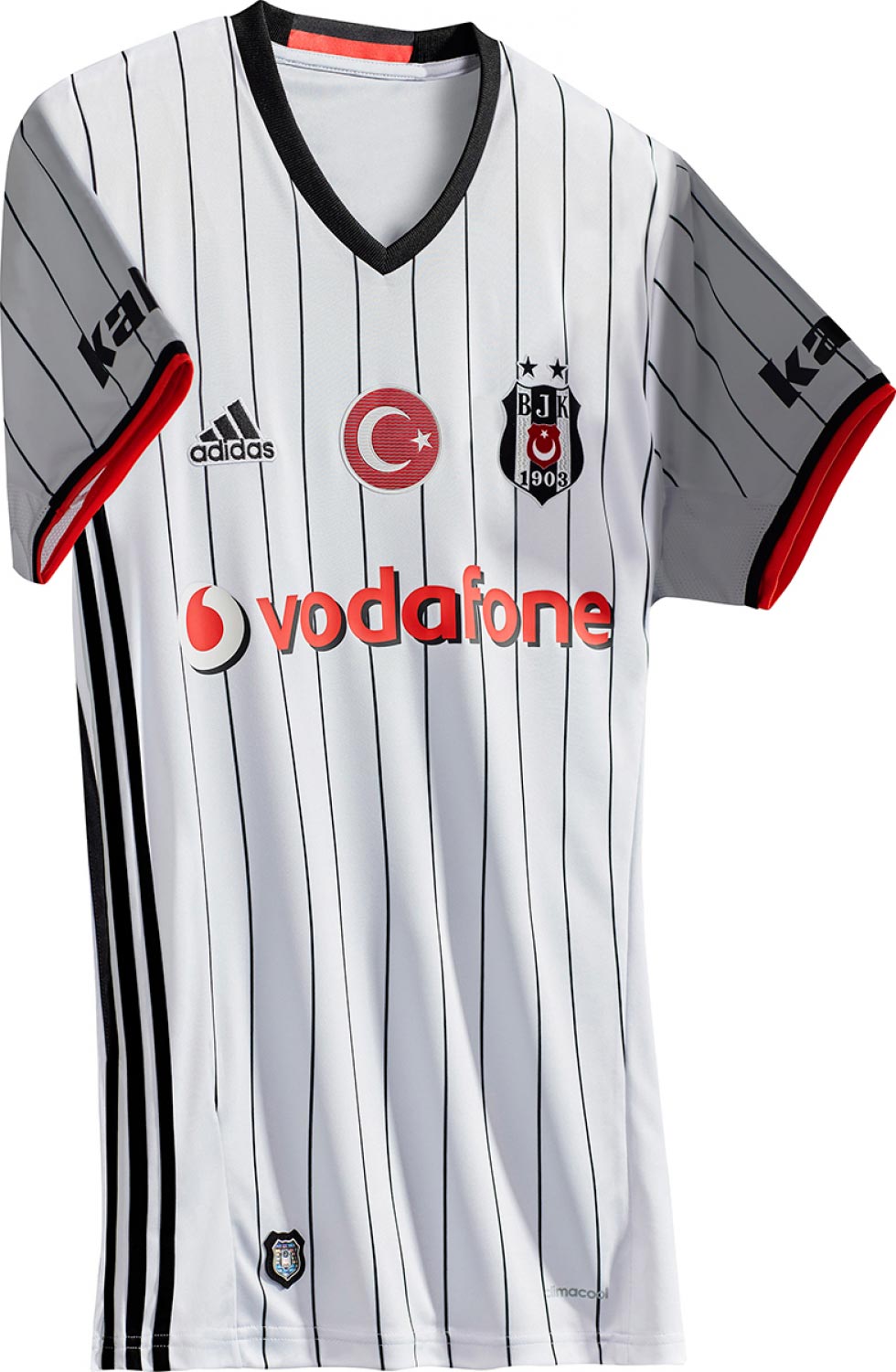
Usually when I look at Turkish teams, I am drawn to Galatasaray, who have had some really sharp designs over the last couple of seasons. Scrolling though the 16/17 kits I saw Besiktas’ home offering and wondered if this team going to compete for the Turkish Super Lig or the American League crown. Holy pinstripes. Don’t like this one at all.

(pic courtesy of Football Fashion)
NEC Nijmegen won promotion to the Eredivisie and decided to put two designs up to fan votes. Based on the post from Football Fashion, the voting was so close that the club will two home jerseys. I like the simplicity and use of club colors for both. Whether two shirts is good or bad, I’m not sure and hope this doesn’t give major manufacturers and clubs a horrible idea moving forward.
If you know anything about the early years of the Premier League, then you’ll know about this shirt:

(pic courtesy of Norwich City)
Now there’s this:

(pic courtesy of Footy Headlines)
Errea decided to bring it back but in white. I think the only positive is that the Canaries are in the Championship, so I won’t have to see this unless I really really want to.

 (pics courtesy of Footy Headlines)
Let’s end on a high note. Footy Headlines brought the new Hajduk Split home kit to my attention and I am so thankful. What a kit. Clean white shirt with hints of gold paired with royal blue shorts and royal blue socks with white turnovers. Real beauty.
——
Check out my previous season previews and other kit reviews on the Strip Club page of the SoccerNomad blog.
——
So those are the ones that caught my eye. If you want to see more, I encourage you to visit the following sites. . .
Quality posts, great pictures and a wide selection on offer.
Plus there are several great podcasts on kits and kit design. Check out the Football Attic kit podcast and the podcast from Design Football.


