Strip Club–Best (and Worst) of 2013/14
The new European soccer campaign is almost upon us. Starting with the final rounds of the 2012/13 season, manufacturers started releasing new strips for the upcoming season. Due to the commercial pressure to release something new every year, clubs and companies are ever more creative and sometimes even risky.
I’m not really going to go too deep into English or Spanish kits. Kit Nerd has assembled all kit releases for the English Premier League at his site, for one stop browsing. I’ve mimicked his idea for the La Liga kits, and will be creating a page that has almost every single kit from the Spanish league for the upcoming season.
Here we go.
Possible the creepiest advertising promotion has to go to Chelsea, who simply teased their home kit, “It’s Blue”. Then adidas released ads with players interacting with blue paint in weird ways. It has to be seen to be believed. Last year Nike brought us Purple Reign Pain (Arsenal and FC Porto) and Stop the Sleeve (almost everyone else). This year the focus has turned to Warrior, who has produced an epic fail in the Liverpool Away and Third kits and one of the worst advertisements in promotion history with the Glory Hole feature of their newest shoe.
Moving on . . .
Starting with AC Milan. Adidas and the Rossoneri look to put last year’s pocket disaster behind them and went with an away jersey that still isn’t quite right. Using the gold trim that has accented recent Real Madrid and Swansea kits was a good thought, but then the three stripes goes and adds thin red and black lines to further clutter the front of the shirt. These additional element clashes with the gold and makes this a miss.

Unfortunately, the pocket has returned, this time as part of a new gold third kit. The shirt itself is serviceable, more of a training kit look in my opinion, but the pocket downgrades it even further. Has there ever been a time in kit manufacture where a pocket has been a good idea?

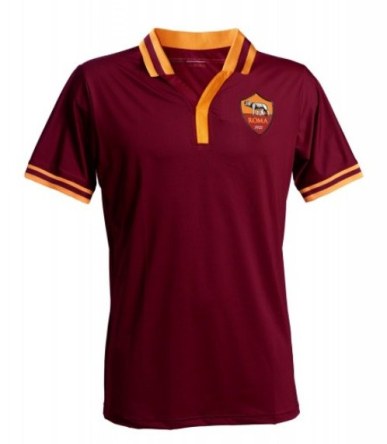
Another Italian team has done something rather unique. AS Roma, due to conflict with Kappa, created a kit that was designed and manufactured by the club. The kit maintains the typical look of the club but adds a couple of innovations, which the post from Football Fashion explains:
- The shirt is void of the technical sponsor’s logo since it was produced exclusively by the Club.
- The serial numbers on each jersey further contribute to its uniqueness.
- A special message will be entrusted to this jersey that is destined to make history. “Solo per questa maglia…Unico Grande Amore” is the phrase and the commitment which will be on the interior of each jersey.
- The roman numerals on the collar represent the Club’s foundation year – 1927 – a style that pays tribute to the tradition: the first jersey that gets inspiration from the early 1900’s ROMAN FC team, one of the three clubs that merged together to give birth to the Associazione Sportiva Roma.
I like the collar and the subtle trim around the collar itself and the sleeves. Nike takes over next year so who knows what will happen.
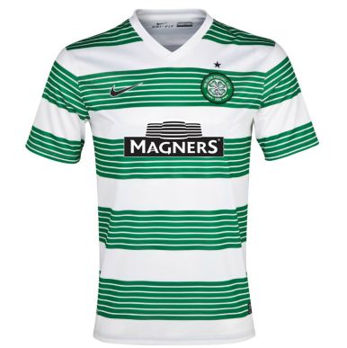
Moving to Scotland, Celtic had awesome kits last year for their 125th anniversary. This year, not so much. The home kit takes one of the club’s nickname, The Hoops, to a new level. Refashioning Manchester United’s awful away kit (blue base with black tire like tracks) from a couple of seasons ago, there are hoops upon hoops, which based on the post on Football Fashion is because “each of the club’s iconic green hoops is made of up seven smaller hoops, which are inspired by some of the club’s greatest players — such as Jimmy Johnstone and Henrik Larsson, who wore the No. 7 shirt.”
I’m not sold.
One quick comment about an English side. Everton is going to get some flack this year. The badge redesign went horribly wrong, causing the club to already backtrack. Focusing on the home jersey, Nike has seen my Stop the Sleeve aggravation and raised me one. A second stripe now adorns the sleeve. For what purpose? Your guess is as good as mine.

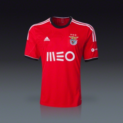
Over in Portugal, Benfica’s home kit is typically solid, some sort of red with adidas striping. This year they have added a sublimated image of their iconic eagle to enhance the offering. Really like this one and I like their refashioned badge as well.
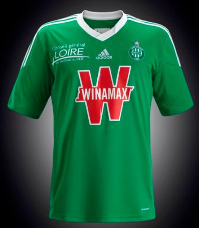
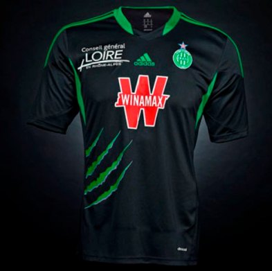
AS Saint-Étienne celebrate their 80th anniversary this season and their kits are kinda cool. The home kit has “the club’s original crest from 1933 is printed on the shirt’s inside upper back (courtesy Football Fashion).” The away set grabbed me due to the claw marks. Haven’t seen this since Cameroon’s unique kit at the turn of the century. The marks are “in reference to ASSE’s adopted symbol since the 1960s (courtesy Football Fashion).” The additional sponsor on the pectoral makes the shirt a little busy, but other than, both are decent.
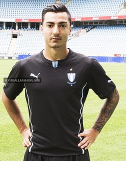
Off the beaten path a little bit, I came across the European kit for Swedish club Malmo FF. As readers of my Strip Club posts know, I am a sucker for black kits, and this kit is no exception. Sky blue and white from the club crest accent this strip, and Puma is using a new collar template for most of their kits, which is kinda meh, but doesn’t detract too much from this shirt.
Speaking of the club badge, it piqued my curiosity. Further research revealed a couple of interesting tidbits. According to Wikipedia, the star on top of the crest symbolizes more than 10 league titles, which is similar to Serie A and other leagues. According to a post on BIGSOCCER.com, here is a possible back story to the Star of David under the club name.
The star beneath the club emblem has nothing at all to do with Judaism nor does the club have any notable Jewish heritage.
The tale of the star is rather simple and goes like this:
Back in the day, Malmö FF:s logo was just the shield with the initials MFF. While MFF was playing some team in another country, legendary MFF chairman Eric Persson (whose nickname was “The Chief”, who held the chairman position from 1937-1975, and who has been described to possess the leadership qualities of an “enlightened despot”) overheard some kid asking his father where the team with the MFF-emblem came from. Eric Persson realized such confusion was unacceptable, and added the “Malmö FF” beneath the shield. And for no reason other than to round off the new logo, he added the star.
Apparently, the star is from the city of Malmö’s old shield. That it happens to be a six-pointed-star rather than a five-pointed one (or seven-pointed, etc) is just happenstance.
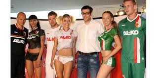
For those that looking for a little eye candy, take a look at the offering from German sportswear firm Jako for FC Augsburg. According to Football Fashion, “the club will wear the same white home kit as last season for its upcoming campaign.” However, Augsburg’s 13/14 away and third kits are both new.
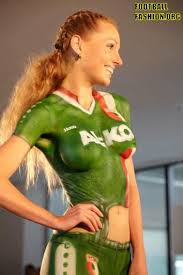
Based on the Football Fashion post, “All three kits were modeled by topless soccer babes wearing bodypainted renditions of the shirt during the launch.”
I’m particular to the red head.
Finally, PSV Eindhoven marks their 100th anniversary this year and has released beautiful home and away kits.

Love the home shirt. Simple, modern and classic all at the same time. A couple of key elements about the shirt presented in the Football Shirt Culture post:
- PSV’s famous red-and-white stripes have been replaced by a solid red shirt that references the colours worn when they won the UEFA Cup in 1978.
- The red jersey also recalls PSV’s successful 1987-88 campaign in which they won the Dutch league, the Dutch cup, and for the first and only time in their history, the European Cup.
- Inside the back of the neck on a bonded woven label is an outline of the famous arch from the main gates of Phillips stadium and the motto “Eendracht maakt macht” (“Unity creates strength”).
This is definitely going on the wish list. Many years ago I had an old PSV shirt, you know made with the hot polyester, the Philips letter peeling off, and the embroidered crest curling, but I loved it. The jersey finally headed to into the dustbin of history and this is definitely a worthy replacement.

The away kit echoes of one of my favorite kits of all time—2000-02 Arsenal Third. This jersey is so fantastic, even the thick sleeve hemming can be overlooked. Thank god it was not a contrasting color, creating a Stop the Sleeve situation.
All in all kudos to the Nike and the club for creating a memorable selection for such an important historical milestone.
So that’s all I got. There are hundreds of kits from all over the world, but I only have so much time. These are the ones that jumped out to me. If you want to see more, visit the following sites.
Quality posts, great pictures and a wide selection on offer.
No trackbacks yet.