Posts Tagged ‘ Kit Nerd ’

Juventus Home Shirt 08/09

Juventus’ first season back after the Calciopoli scandal was a relative success, with the Old Lady finishing third and qualifying for the Champions League. The following season, the club improved on their position while giving a good account of themselves in Europe.

The playing staff saw turnover ahead of the 2008/09 campaign with Birindelli leaving the club after a decade of service and almost 300 appearances. Zalayeta also departed, although his career never hit the anticipated heights. To help reinforce the squad, Mellberg, Amauri, and Poulsen were signed and Marchisio and Giovinco returned from loan.

The Bianconeri challenged for the scudetto before falling away in the spring, which eventually cost Ranieri his job. Alessandro Del Piero led the way with 13 league goals, supported by Amauri and Iaquinta, with Trezeguet out for most of the season. In the Coppa Italia, Juventus overcame Catania and Napoli before losing out to Lazio in the Semi-Finals. The Biancocelesti would go on to win their fifth Coppa title.

Juve were back in the Champions League and, after breezing through the Qualifying Round (5-1 over Artmedia Petržalka), the Bianconeri met Real Madrid on Match Days 3 and 4, winning both matches. The Old Lady won the home match 2-1 and then went to the Bernabeu where Alessandro Del Piero turned in a performance for the ages, scoring both goals. The Black and Whites topped the group but fell to Chelsea in the Round of 16.

Juventus 2-1

Real Madrid 0-2 Juventus

Moving on to the kits, Nike took over the contract for the Italian club in 2003 and had it until adidas became the manufacturer in 2015. This one was a solid effort, not the best but far from the worst, with the 06/07 and 14/15 versions the best in my opinion.

Juventus’ traditional black and white stripes were accented by bright yellow accents at the collar, cuffs and bottom hem. Yellow was used instead of the red from the previous season and I preferred this look, so much that I bought a replica version. The cuffs and hem were particularly interesting as the yellow bits were sown on under the main fabric to create a flare effect. There several different iterations of the kit as it was worn with white shorts and socks, white shorts and black socks and black shorts and socks. Have to say I liked this last version the best.

The replica had an embroidered crest with a thick heat transfer of the New Holland logo. There were some additional touches with the word BIANCONERI and two stars on the inside neck tape and JUVENTUS in gold across back neck.

As I was researching I noted that the league version of the shirt had stripes throughout the back of the shirt while the Champions League version had a black box for the name and number set. At first I thought I was imagining things but the Switch Image Project confirmed this slight alteration.

I ordered this shirt with JUNIOR 7 on the back. While I don’t wear it as much as I used to (read why here), it still hangs in my closet and maybe one day I’ll get it framed for the mancave I dream/talk about.

——

Resources

Wikipedia

Colours of Football

Switch Image Project

——

Check out more posts on kits from clubs and countries around the world on the Strip Club page. And yes. It’s safe for work.

Arsenal Kit Pod

sam-collection

Arsenal Kit Pod

My brother Sam came back on the SoccerNomad podcast to discuss his Arsenal kit collection and Gunner kits through the years. We talked about the best and the worst, unicorn kits and more.

Images of kits we discussed:

FAVES

arsenal-70s

Arsenal's Thierry Henry celebrates at the end of the game after the 1-0 win against Southampton

away-88-89

WANT LIST

arsenal-70s

arsenal-125

arsenal-98-99-away

OLYMPUS DIGITAL CAMERA

WORST

bruised-banana

mid-90s-change  purple-reignblue-bottle   15-16-3rd

 16-17-third

Arsenal kit history resources

Historical Football Kits

Design Football pods

the-arsenal-shirt

The Arsenal Shirt: Iconic match worn shirts from the history of the Gunners by James Elkin (Author) and Simon Shakeshaft (Author)

Museum of Jerseys blog

SoccerNomad blog posts

——

Thanks for listening! You can also subscribe via iTunes and please leave a rating and review. Follow me on twitter @austinlong1974.

Guest Post: JR Francis on Atlanta United 2017 Home Kit

full-kit

It’s… fine.

The best assessment I’ve heard of the kit goes like this, “Its exactly what you thought it was going to be.” In many ways, this is a good thing, but when it comes right down to it, there is simply nothing, design-wise, to get excited about.

It is thrilling to HAVE a kit now. A coach, many players, a world-class training facility and a soccer specific stadium on its way for the coming season. These are all things for the fans to celebrate and get excited about. The team we have all been waiting for is coming, and with each passing landmark, actual games are creeping closer and closer.

We are incredibly lucky that the team was able to partner with a company that allowed their logo to be rendered in gold. So many teams around the world have their kits ruined by a terrible sponsor logo, a clashing color, or by having to sport a pyramid scheme across their chest. We have a respectable company, with heartfelt commercials. They have a simple, clean, horizontal version of their logo, and it’s in beautiful gold across the front. Three cheers to American Family for being a great partner.shirt

But overall, it’s a vertical striped kit.

My complaints are really just nitpicks and some are even more about Adidas templates than this particular design. It’s a red shirt. Bah. I’m in the camp for minimizing red, and using it as a pin stripe or highlight. Think how Philly uses baby blue. I was really hoping for a black base with red stripes, as this would provide the richness and severity of aggression. Red is an entirely overused color in sport to the point of being cheap. The collar is just a plain black ringer with a sewn V-neck treatment; no stripes, lines, no work-friendly golf collar.

The stripes, as one likely could have predicted, are simple. Thick black, thick red, clean edges, no pin stripes, no texture within the stripe, no design along the edges. I’m assuming we will get all of those additional features in future years, as they are required to update a jersey every year.

The plain red back is bad. It looks like two different shirts were sewn together, one striped, one plain. There have certainly been some awful back treatments on striped designs, but to not even try is a fail. The widest two black stripes could have been run down the back, leaving room for the numbers. The stripes could terminate above and continue below the number. Something. At least the back got a jock tag with the cool 2017 logo from one of the first t-shirt designs.

The Adidas stripes stopping at the sleeve hem is wonky. I would have preferred it having a gap for the MLS logo, and going all the way down the sleeve. The MLS logos and badge in their plastisized, textured style on the authentic are really nice and the only spot we’ve added much of any personality.

The jersey is fine. It looks nice. I will scream at the top of my lungs for the guys wearing it. But it certainly ain’t “lit” or “fire” or anything of the like. Its’ simple, clean, and good.

More than anything else, this jersey reminds me of how bad the name is and how much I despise red and black. We will never be the Oregon Ducks of MLS, we will never have a huge stylistic play, we will never be the boldest or most distinctive design in the store. It can certainly be argued that classic and plain are a good thing and we don’t want to look wild and crazy. But it certainly isn’t an option. And our name SO means absolutely nothing to anyone. In a city full of incredible history, we certainly cheaped out and picked a name with zero visualization.
Here is looking forward to seeing what the away brings. I’m hoping for zero white on it at all, like the majority of ATL UTD marketing. My fingers are crossed for a real collared shirt and LOTS of gold!

——

JR is a frequent guest on the SoccerNomad podcast and you can follow him on twitter @paynomind.

Atlanta United 2017 Home Kit

tabernacle

Atlanta United unveiled their 2017 home kit last night in a big celebration at the Tabernacle in downtown Atlanta. Susannah Collins from MLS emceed the event, which included Arthur Blank, Darren Eales, Carlos Bocanegra, and Mayor Kasim Reed.

Recently I became a season ticket holder and an email hit my inbox last week about an upcoming event: the unveiling of Atlanta United’s inaugural home kit. This has been one of the most talked items about the team since the announcement. Once the logo and color scheme were released, fans and designers have been posting concept kits and discussing possible looks. I was honored to be part of the Design Football.com Atlanta United concept kit contest and fans from all over the world came up with some really great designs. On top of that, Dirty South Soccer has been accumulating designs and has made it a big topic on the Mouths of the South podcast.

The general consensus was that the shirt would be similar to the AC Milan home shirt and their iconic black and red vertical stripes. After that, speculation focused on all the permutations: thickness of the stripes, striped or solid sleeves, collar/no collar, solid or striped back, trim and accent color, and finally the placement of the trademarked three Adidas stripes.

Speaking of Adidas, ahead of Euro 2016, the company made a major design change, moving their three stripes from the shoulder to the torso. Adidas has a contract with MLS through 2017 and most of the kits released for the 2016 season incorporated this change, so I wondered. . . 1) where would the stripes be and b) what color would they be?unveil

unveil-2

After a series of speeches and cheering, Tito Villlaba, Chris McCann and Andrew Carleton stepped forward in the new strip.

shirt full-kit

I loved it. Five broad stripes with gold Adidas striping on the shoulders. I would have preferred the mark on the torso but I’m over it. Two things really grabbed me: the red sleeves and the crest. Most mock ups had striped or black sleeves. The red lightens the tone of the kit and this really works for me. The A, which is the focal point of the crest, has texture on the authentic shirt, created by a series of diagonal lines. Close up the logo really jumps out and this is a wonderful feature. Another feature of the authentic shirt is the cuff, which has Atlanta United on it. Something to keep in mind when deciding between authentic and replica.

american-family-insurance-logo

Finally, American Family Insurance altered their logo to gold to complement the shirt. Had they kept their standard branding, the shirt could have gone sideways very quickly.

For everything on the kit, check out these resources:

I pre-ordered my shirt ahead of the event. Didn’t even need to see it. This is the first shirt ever for the club so that in itself made it worth having. Plus I didn’t want to stand in line. (I admit I was jealous of those that wait in line and were able to walk out of the event with the shirt on.)

To wrap up, I asked some Atlanta United fans their thoughts and here’s what they had to say.

Heather McBrayer Cooke After some reflection, I think it’s fine. Not great, but fine. I’m never a fan of the broad vertical stripes but I do absolutely love the black shorts with the gold stripes. The detail on the back is a very nice touch as well. I honestly think the unveiling was so stinking dramatic that it set you up for a let down.

Robyn Saghini ❤❤❤❤❤❤❤ it!

Jorge E. Alonso 200% on board. Absolutely love it. And it looks beautiful with our (Terminus Legion) scarf on it.

Cristoforo Romano Classy!

Justin Koehn Not too shabby. I like it untucked much more for some reason with the solid black shorts. Not a huge fan of the solid color back, but overall I’d say i’m happy with it.

Charles Phillips It’s exactly what we expected, but it’s executed perfectly. I like the broad bars as opposed to thinner stripes. I also think the red field on the back in place of stripes is going to look great with the number sets. The Inaugural Season flair on the back of the neck is a great touch that’ll make this particular shirt special. Part of me was hoping for the new Adidas style stripes down the torso, but the shoulder stripes work great too. I would’ve preferred some accents or design on the socks, but I can appreciate them going clean and elegant.

Kelly Carter Love it. Prices are fair and comparable to the league. Design was expected but desired. Sizing runs small for authentic per usual. I’m glad the AmFam logo isn’t bigger like other sponsors in the league. Yes, it does look quite similar to the MetroStars jersey, but that was bound to happen given the color scheme.

Jon Hicks Pretty damn cool. I concur with Charles the Adidas strips down the torso would have been awesome but I can live without it. The inaugural season on the back is killer. 

Matheus Gonçalves Some might say the kit is kind of too basic, or that Atlanta United stayed in the comfort zone and haven’t been innovative or creative enough. I understand the point but we’re not talking about Apple, Microsoft, Google that needs to innovate and be disruptive or, you know… this is a soccer team kit. Maybe, for the future, or for the 3rd kit we could have some fading lines down the torso, or some different design but still the Atlanta United kit is classy, It’s sharp, the golden and black stripes are solid and the kit is awesome, I love it.

Andy Hollums I love it! Executed perfectly. And in really glad they went solid on back. The only thing I don’t like about Montreal’s shirt is that they have short stripes at the bottom on back. I’m really glad we didn’t do that.

Charlie Flint I think it’s safe and relatively what everyone expected – but a great design and looks good!

Jen Pahl I really like it. It is sharp and we will stand out on the pitch.


Let me know your thoughts below. You can follow me on twitter @austinlong1974 and make sure to check out the rest of the SoccerNomad blog. Also check out the SoccerNomad podcast on podomatic or on iTunes, just search SoccerNomad. I appreciate all feedback, so please leave a rating and review.

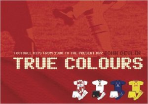
John Devlin/True Colours

true colours cover

John Devlin/True Colours

John Devlin, author of True Colours: Football Kits from 1980 to the Present Day, Volumes 1 and 2, came on the SoccerNomad podcast to talk kit history and design. His wealth of knowledge is remarkable and I learned a lot. After a great conversation, we finished with some listener questions.

Learn more about kits and get in touch with John.

——


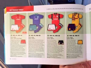
Sample page from True Colours

true colours sample page

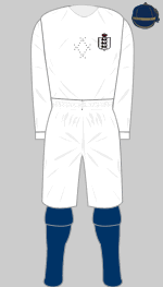
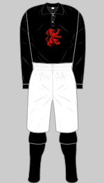
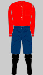
Early kits

England 1872-1879

england-1872

Aston Villa 1878-1879

aston-villa-1878-1879

Woolwich Arsenal 1894-1899

arsenal-1894-1895_i

(images courtesy of Historical Football Kits)

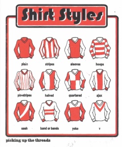
Sample jersey styles from Picking Up the Threads

picking up the threads

Kit Design Elements

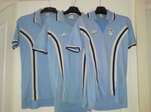
Tramline kit

coventry city
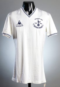
Jacquard

tottenham-hotspur-1982-1983-le-coq-sportif-paul-price-centenary-match-worn-shirt-a

Sublimated dye

FSHR-MANU-H1995

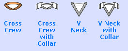
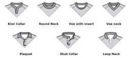
Collar Styles

collar-styles-soccer-jerseys

1771835_orig

Sublimated-Cricket-shirts-collar-Styles

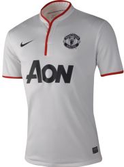
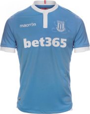
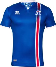
Iceland_Home_1024x1024norwich-city-16-17-third-kit-1Man-Utd-Away-Jersey-2013stoke-city-16-17-away-kit-1


50 Greatest Football Shirts Ever

Additional resources

——

Thanks for listening! You can also subscribe via iTunes and please leave a rating and review. Follow me on twitter @austinlong1974.

SoccerNomad Podcast: EPL 16/17 Kit Preview

300x300_11598816

EPL 16/17 Kit Preview

JR Francis (@paynomind) returned to the SoccerNomad podcast to look at the kits for the upcoming EPL season. After we both rant about the Manchester teams, we gave comments on the rest of the league and picked our top 5. Plus there’s some news and notes on the manufacturers.

Resources

——

Thanks for listening! You can also subscribe via iTunes and please leave a rating and review. Follow me on twitter @austinlong1974.

Manchester United Dollar Date (16/17 home kit)

manchester-united-16-17-home-kit-9

Photo courtesy of Footy Headlines

Manchester United released the new home shirt for 16/17 season, the second offering from the new adidas contract.

I recently recorded a podcast with Design Football regarding the new kit and Manchester United kit design in general. In my preparation I was struck by the fact that very little is known about the early kits of Newton Heath. Also the club has used red first choice tops since being renamed Manchester United in 1902 except for an all white strip with a giant red v from 1922-27 and a cherry and white hoops shirt for a short time in the 30s.

manchester-united-2016-2017-adidas-home-kit-16

Photo courtesy of Football Fashion

Several design elements are used on the new shirt. Red is used on the crew collar and cuffs, rather than a contrasting color, and this hasn’t been done since the 2007-09 seasons. That shirt is one of my favorite United jerseys and the look really works. The red is complemented by white adidas stripes down the torso rather than the shoulders.

shaw

Photo courtesy of Manchester United

Adidas has also introduced a vertical stripe of interlocking hexagonal shapes that divides the shirt in two shades of red. According to the Manchester United press release. . .

In the second year of the partnership with United, adidas has taken cues from the club’s illustrious history, with a two-tone red-split design evoking the two-tone Newton Heath kit of 1878.

The official coat of arms for the City of Manchester was the basis behind the idea for the honeycomb graphic that knits together the two red block designs on the shirt. It was inspired by the worker bee which appears in the crest and originates from the Industrial Revolution, in which Manchester played a significant role. The strong work ethic of the city is also part of the club’s DNA, instilled in the players whenever they pull on the red shirt and represent the club.

Regarding the Newton Heath comment, I just don’t believe that’s true. United’s earliest home shirts were white with a blue cord. The assumed green and gold kit didn’t arrive until 1881 and there indications that a red and white home shirt was used in the late 1880s and early 1890s. If anything I would love for a manufacturer to create a half red/half white shirt, although it could a) cause kit clash headaches and b) make people think that Feyenoord are playing.

As for the hexagons, using the bees from the Manchester Coat of Arms is a bit of a stretch. I don’t mind it, even though, as Jay from Design Football mentioned, the way the hexagons are causes the shirt to not be divided evenly.

There are also small touches, with a Newton Heath plaque on the inside neck and the letters MUFC in the hexagon shapes on the back of the neck.

manchester-united-16-17-home-kit-8

Photo courtesy of Footy Headlines

The shorts are white with red adidas markings and look fine. I’m sure there’s some sort of technological advance but essentially they are the same shorts. I really like the socks which are black with a red band on the turnover plus a red devil on the shin. I applaud adidas for using this part of the badge and hope they continue to do so in the future.

Another great home kit from adidas and will keep my eye out for a deal so I can pick one up.

Read my comments on the away kit here.

——

Official Manchester United release

Find out more about the history of Manchester United kits at United Kits and Historical Football Kits.

——
Read the rest of my Strip Club posts here and follow me on twitter @austinlong1974.

SoccerNomad Podcast: Summer Tournament Kits

copa america Euro-2016

Summer Tournament Kits

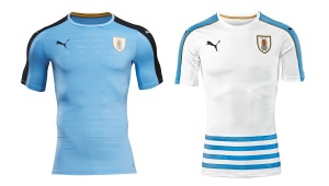
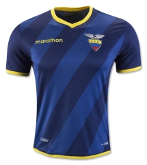
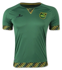
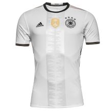
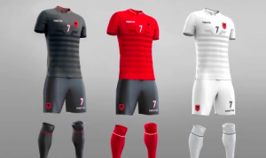
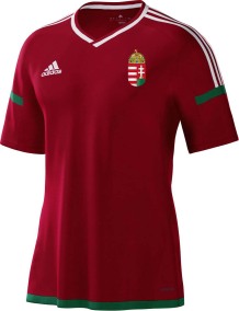
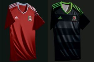
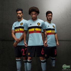
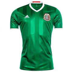
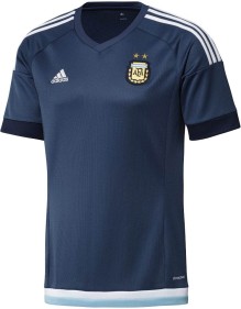
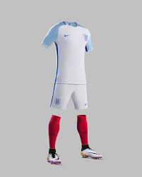
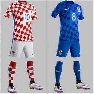
Fellow #KitNerd JR Francis (@paynomind) came on the SoccerNomad podcast to talk about kits for the upcoming tournaments this summer–Copa America Centenario and Euro 2016. We didn’t discuss all 80+ kits but discussed some general trends, mentioned some of our best/worst and had a passionate discussion about the future of US kits.

For more information, check out these podcasts and posts.

Below are images of the some shirts we discussed:

Uruguay home/away

uruguay-x-puma-2016

Ecuador away

ecuador away

Jamaica away

jamaica away

Germany away

germany home

Portugal away

Portugal-Euro-2016-Away-Kit (4)

Belguim/Portugal friendly

belguim portugal

Albania set

albania

Hungary home

Hungary-Euro-2016-Home-Away-Kits-Vote (3)

Wales home/away

wales

Belguim away

17943_3_max

Mexico home

mexico

Argentina away

argentina-2015-away-kit-1

England home

england home

Croatia

929379_2013636628861358_1362808606_n

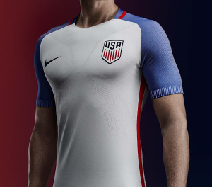
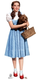
USA home/Dorothyusa-2016-copa-america-home-kit-4 Dorothy - Inspiration

USA away/Cop Car

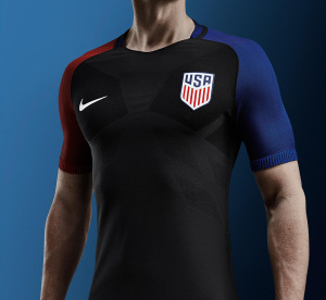
usa-2016-copa-america-away-kit-1 download

——

Thanks for listening! You can also subscribe via iTunes and please leave a rating and review. Follow me on twitter @austinlong1974.

Personal Kit Collection 2016

Inspired by a series of tweets late 2012, I took stock of my kit inventory and put together a post documenting my personal kit collection at the time. As you can see my collection was all over the place in terms of teams, manufacturer and style. Since then, I have had a couple of realizations (read: interventions) and talks with myself. Combine that with a big move and my collection is now under 30 jerseys. I have probably owned over 50 shirts through the years but things happen. My collection pales in comparison with others, especially JR Francis, as we discussed on one of his appearances on the SoccerNomad podcast, but I love collecting and talking about kits.

Manchester United

Home

IMAG0524

Away

IMAG0528 IMAG0530

US National Team

IMAG0504

National Teams

 IMAG0503

FC Barcelona

 IMAG0490

Juventus

IMAG0493

Atlanta Silverbacks

IMAG0491

My current plan is to follow my self-created rules.

  • Since I’ve narrowed my focus to just following Manchester United at club level (and Atlanta United when they take the field in 2017), only buying a shirt every three years or ones that match my tastes. I’m currently back filling my Manchester United collection.
  • In terms of national team kits, only buying ones of the United States Men’s National Team. Why? Because I’m American, if only by an accident of birthplace. (Of course, thanks to Nike, this policy has been a real problem as they keep designing crap shirts.)
  • Only buying personalized jerseys (printed with JUNIOR 7) and not buying “hero jerseys”.
  • Only buying shirts on sale (promotional or otherwise) or wait until the release of the following set of kits.

Since I put these into effect a couple of years ago, I have done quite well, only breaking the rules once, and that was to get an authentic Holland Away jersey from Euro 2012. It was 50% off at Classic Football Shirts and I couldn’t pass it up. However I’m close to breaking several of the above rules for the new Croatia Euro 2016 away shirt.

croatia-euro-2016-away-kit-3

For all the posts on kits that I have owned, own currently or want to own, please visit the Strip Club page of the SoccerNomad blog.

Here are some good resources, especially if you’re looking for vintage or retro shirts:

Feel free to share your faves/collections or great sites for shirts in the comments below.

Arsenal Change Shirts-Premier League Era

My typical modus operandi is to spout off without information or consideration, and I have always claimed that Arsenal and Chelsea have had the ugliest change shirts in the Premier League era. In the last two decades, the two London teams have been United’s biggest rivals for hardware, so I have had a keen interest in their sporting and fashion performance. With all that said, I decided to look at each team’s away kit collection and make an informed, well-reasoned claim to their kit ugliness.

Here are my thoughts on Chelsea change kits.

As I skimmed Arsenal’s away shirts through the years, I was surprised by how much the Gunners used white as a change strip but now almost never use it. I also learned the backstory of the club’s yellow and blue kit:

In 1968 the FA banned navy shirts (they looked too similar to referees’ black kit) so the Gunners turned out in yellow shirts and blue shorts for the first time in November, an outfit that recalled that FA Cup win of almost 20 years previous.

Finally, the navy blue shirt that I like so much hearkens back to an option used in the first quarter of the 20th century.

Going through the kits, I was reminded of some really nice strips, including their third strip from 07/08 and the current 15-16 away, while the 97-99 away kit will be always locked in my brain as the moment Overmars bore down on Schmeichel and scored to give the Gunners a 1-0 victory and swung the momentum to London for that season’s Premier League. (Check out Historical Kits link for the visual.)

As for the Premier League shirts, honorable mention for the worst strip goes to. . .

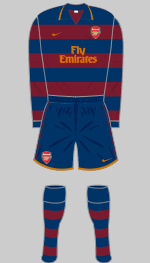
2007-08 Third

arsenal-2007-2008_third-e

This one should be so great, combining my favored navy blue with the red currant shade used for the 2005-06 home shirt. The result is blech and is made even worse with the red Arsenal badge jarring against the darker red.

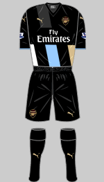
2015-16 Third
arsenal-2015-2016-3rd

Is it black? Is it blue? (According to Footy Headlines the color is anthracite.) Is it Newcastle in disguise? Why the alternating bands start below the sponsor logo is beyond me. Plus three different colors? Plus the bands are at angle? Clearly out of ideas on this one. (Although the monochromatic gold badge is quite nice.)

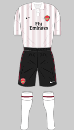
2009-10 Third

arsenal-2009-2010-third

Plain but not. The pin stripes are less visible at greater distances but close up create a very weird look. Nike and the club have used pinstripes on different kits over the last dozen years or so but not to great effect.

THE WORST

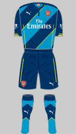
2014-15 Third

arsenal-2014-2015-3rd

This kit is the continual regression of the navy blue and turquoise kit introduced in 94-95. The next version in 95-96 wasn’t too bad, and Nike reintroduced the color combination in 11-12 with a Monaco-esque verion, but Puma just took the design and crapped all over it with more stripes and lime green accents.

_78246569_arsenalkit_getty

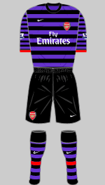
2012-13 Away

arsenal-2012-2013-away

Nike introduced their Purple Reign (Pain) line for the Gunners and Portuguese power Porto. Why? I have no idea? Purple belongs to Anderlecht, Real Madrid, Fiorentina and Orlando City. (Probably others that I’m forgetting.) The choice seemed to out of left field, much like the 82-83. From Historical Football Kits:

In 1982 Umbro introduced what became known as the “bluebottle strip,” a mirror image of their new home kit but in green and navy blue. The kit proved unpopular with supporters and was replaced the following season by a rather more traditional affair that substituted navy for royal blue and, for the first time, incorporated red trimmings.

article-2632022-1DFA236900000578-608_306x423

1991-93 Away

arsenal-1991-1993-change

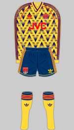
The bruised banana. A yellow and blue based away strip. Check. JVC sponsor. Check. Old school adidas logo. Check. Short shorts check. Unsettling geometric pattern that captures 90’s kit design. Check. Simply doesn’t work for me although it is iconic.

enhanced-6796-1412693952-5

As with Chelsea, maybe I hate Arsenal’s third shirts more. Their 90’s designs really weren’t that bad (considering what was going on around them) but the travashamockeries of the last 20 years overshadow everything else.

Arsenal fans, how do you defend your club? Those with anti-Gooner bias, what did I miss? Let me know in the comments below.

Special thanks to Historical Kits for the images.

——

If you want to learn more about Arsenal wearing variants of their change strips, check out this post from Cork City Kits.

For a detailed look at Arsenal kits from the adidas years (1986-1994), read more at Museum of Jerseys.

——
Read the rest of my Strip Club posts here and follow me on twitter @austinlong1974.